Real You Chocolate
BRIEF
Love your true self and you will be loved by others.
This dessert reflects this concept from the packaging to the chocolate itself. It is hoped that by presenting this gift box, people can make their mood self-evident, and convey the encouragement and courage to "Be Yourself" to the recipient.
Timeline
Sep-Oct 2022
Type
Brand Idendity / Typography / Package Design
INSPIRATION
The design tries to show the process of meeting people with chocolate.
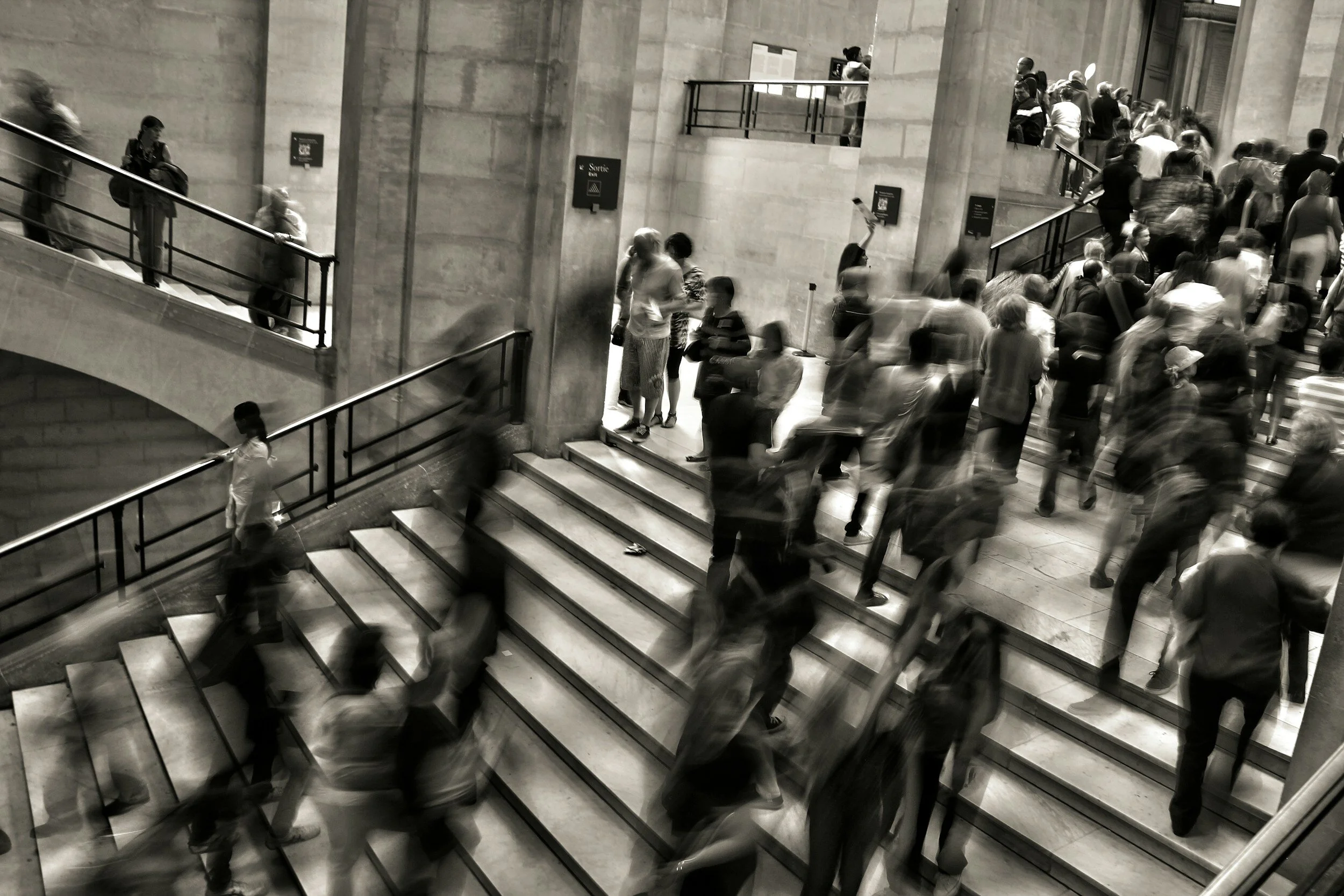
When we gather together, we disguise ourselves. Everyone grinds themselves into the same shape and integrates into society. It's getting harder and harder to open up to each other and show who you really are.
RESEARCH
High Population Density
When we gather together, we disguise ourselves. Everyone grinds themselves into the same shape and integrates into society. It's getting harder and harder to open up to each other and show who you really are.
Socialization
Observe office workers walking on the road. Similar suits make me feel like everyone is disguising themselves in order to fit in.
PACKAGE DESIGN
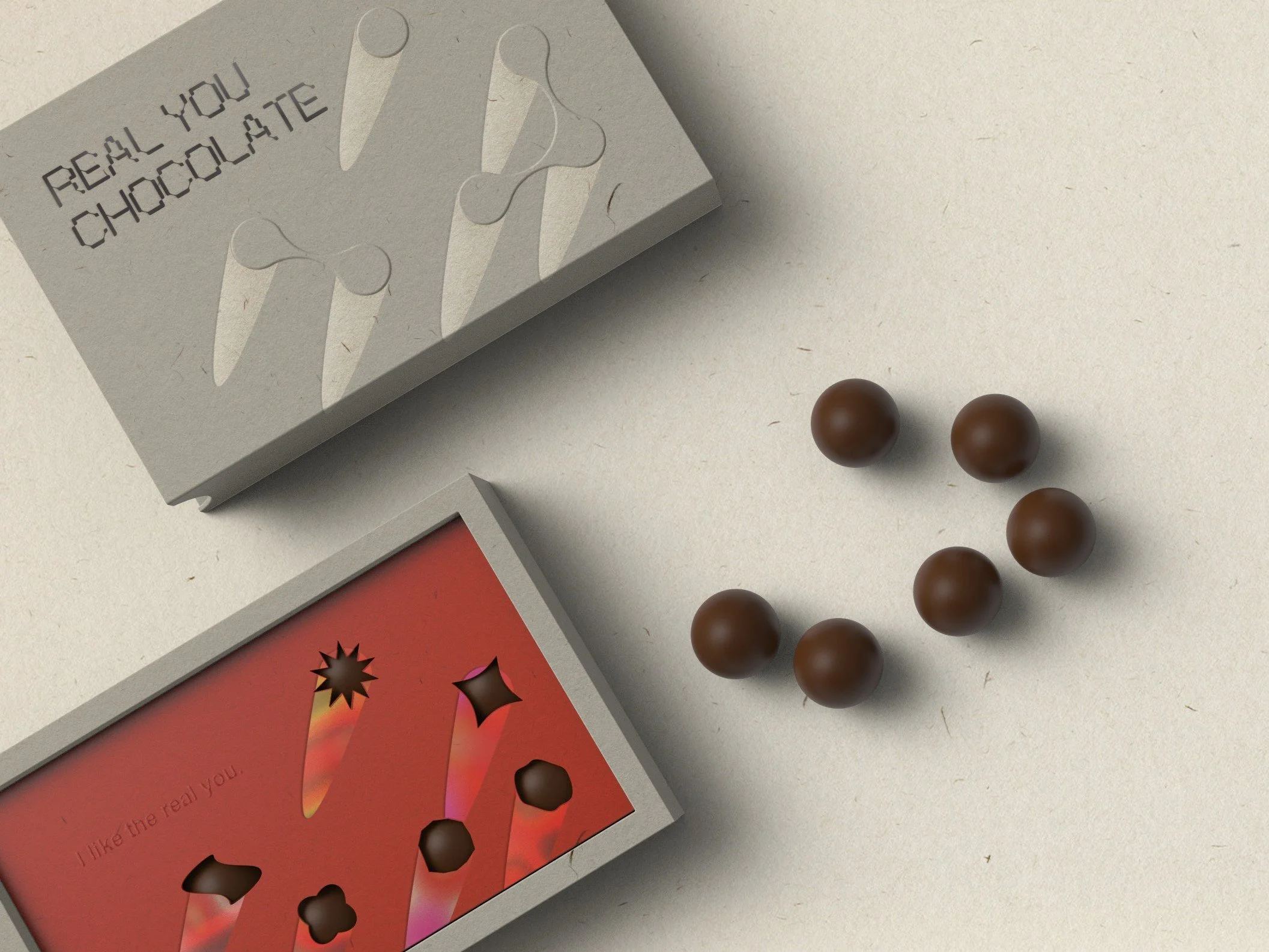
Mix very different colors. Showing the rich and diverse inner of each person.
Use Illustrator to transform graphics into exaggerated shapes based on circles. This shows that people have very different real appearances under the same appearance.
The circles become a variable shapes. Fill the shadows with colorful colors. Like all kinds of people, like shooting stars.
TYPOGRAPHY
The font design continues the same concept, expressing the interaction between people with the connection between circles.
Try to unify the font standard with grid, and also echo the design concept of "same shape". Adjusting the font size has a camera zoom feel.
A layer of inner packaging.
After opening, you can see that the graphics become colorful
B layer of inner packaging.
Both layers choose the red color that represents the human body and blood.
MINDMAP
SKETCH & IDEATION
DESIGN PROCESS
Inspired by the busy people overlooking the city streets. The same pace, the same light and shadow, with the same shape to cooperate and compromise with each other.
We need to constantly run in with each other in order to better understand each other's truest appearance. Just like filling chocolate, you need to slowly taste the chocolate shell to see his filling, and there may be unexpected surprises.
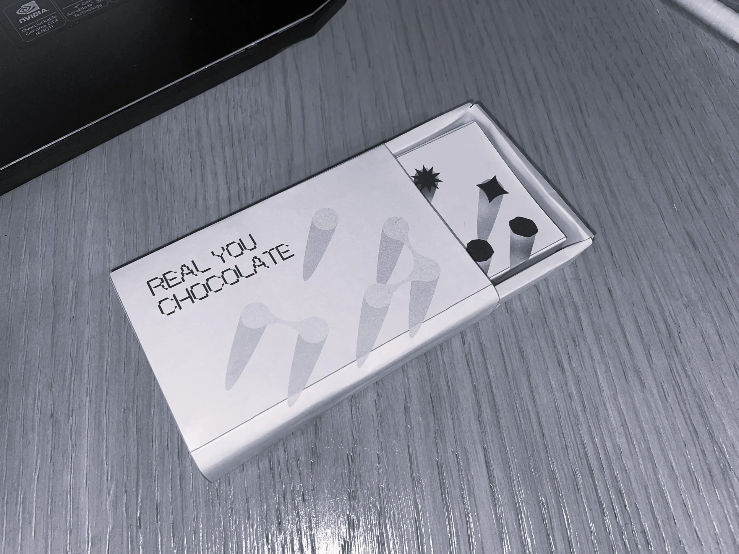
Remove the outer box can see a different inner design. The circle shapes turns into an ever-changing shapes, showing the different personality of each person.
The shadow shape part uses laser silver colour to present the colourful effect, so as to express the diverse appearance of people composed of many different emotional elements.


